
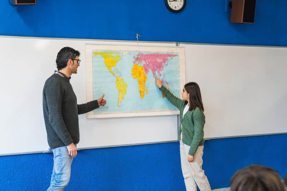
Have you ever gotten lost on Google Maps, wondering what’s going on on the other side of the planet? Did you check if they mentioned “Palestine” anywhere, or which borders they chose to display? Did you look up what name they chose for the sea where Taiwan is?
Maps appear as innocent tools of orientation, simple representations of physical reality. Yet they are never neutral. As the French geographer Yves Lacoste famously remarked in 1972, “Geography is first and foremost used to wage war.” The more one understands space, the greater the power to dominate, organize or exclude. New and old power struggles over land are unfolding everywhere. Throughout history, people have fought over who is most legitimate to claim the land.
The earliest maps were strategic devices: they told armies where to strike, where to hide and how to control resources. By the eighteenth century, maps had moved into aristocratic salons, not simply as decorative objects, but as symbols of knowledge and authority. To display a world map was to display power.
Cartography enabled political institutions to establish and enforce borders, while offering citizens a framework to imagine the territory to which they belonged. But what maps offered was not a mirror of the world — it was a vision shaped by political choices and agendas.
The illusion of neutrality
World maps are still widely presented as neutral representations. In classrooms, atlases teach children where countries begin and end. Yet the Earth itself, if observed from space, reveals no such lines. Its surface is marked by oceans, forests, mountains and cities — but not borders. By portraying these boundaries as natural and permanent, maps make it difficult to envision change. They naturalize political decisions and conceal the struggles that created them.
For example, most world maps place Europe at the center, implicitly suggesting that it is the world’s reference point. Nations such as New Zealand are pushed to the margins, as if they were peripheral to the world order. Similarly, maps make the United States and Russia appear far apart, even though the two countries nearly touch across the Bering Strait. A flat projection reinforces distance where, geographically, proximity is far more significant.
In this sense, maps function symbolically: they shape our mental geography. They tell us what is central and what is marginal, what is large and what is small, what is powerful and what is weak. The school map becomes not just a pedagogical tool but a political text, teaching children not only geography but geopolitics.
Continents as social constructions
The projection of a spherical Earth onto a flat surface has always been a challenge, but the question is not merely technical. As geographer Christian Grataloup argues, even continents themselves are social constructs. While they are presented as natural categories, they are in fact human inventions, largely defined and named by Europeans.
Europe is perhaps the most striking case. Geographically, the continent has no clear separation from Asia. Over the centuries, its boundaries have shifted according to diplomatic needs. Russian Tsar Peter the Great insisted in the eighteenth century that the Ural Mountains marked the edge of Europe, ensuring that part of Russia remained within Europe. More recently, in 2004, French President Nicolas Sarkozy justified Turkey’s exclusion from the European Union by claiming: “La Turquie n’est européenne ni par sa géographie, ni par sa culture, ni par son histoire. Elle n’a donc pas sa place en Europe.” (“Turkey is not European by its geography, nor by its culture, nor by its history.”) Such statements demonstrate how the supposedly natural concept of a continent can be mobilized to legitimize political exclusion.
Continents, then, are not mere landmasses surrounded by water. They are categories imbued with cultural and historical weight, used to draw distinctions and to naturalize differences. They become tools of symbolic politics, shaping identities and justifying hierarchies.
The politics of projection
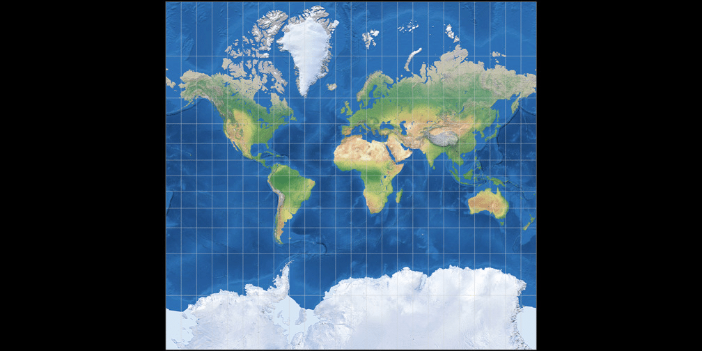
The choice of map projection is never innocent. The most familiar, the Mercator projection, has long been criticized. Designed in the sixteenth century for navigation, it preserves shape but grossly distorts size. High-latitude regions appear far larger than they are, while tropical regions are compressed. As a result, Europe and North America look dominant, while Africa and South America appear diminished.
Alternatives have been proposed. The Gall-Peters projection, introduced in the 1970s, corrected size but distorted shape, leaving continents stretched and unfamiliar. In 2018, cartographers developed the Equal Earth projection, an attempt to reconcile proportion with aesthetics. This new projection has been promoted for use in schools, offering students a more balanced vision of the world.
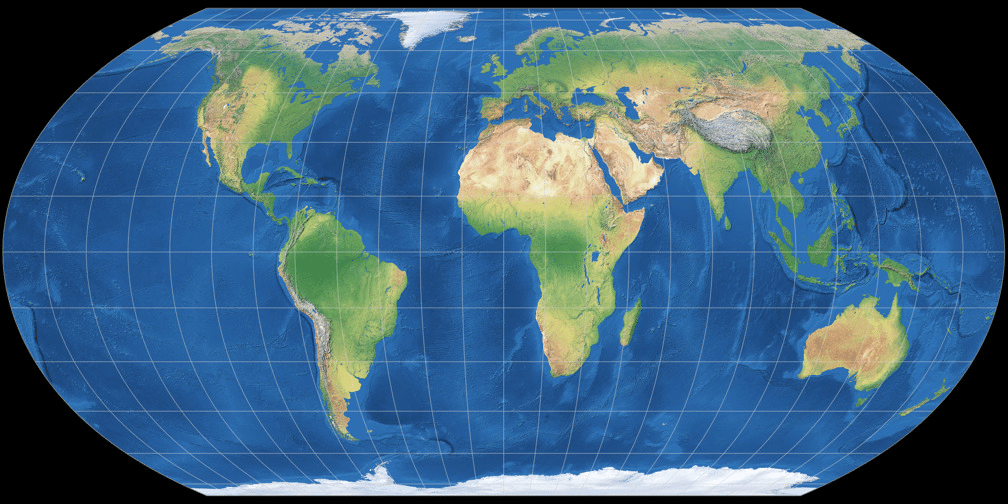
These are not trivial adjustments. Each projection conveys a worldview. Each shapes how we imagine relative power and significance. A map that shrinks Africa and inflates Europe does more than misrepresent geography — it reinforces a symbolic order rooted in colonial history.
Symbolism and diplomacy
The symbolic function of maps extends directly into diplomacy. The African Union has actively campaigned for the adoption of projections that represent Africa more faithfully. Its leaders argue that distorted maps contribute to Africa’s marginalization in global politics.
Fara Ndiaye, the co-founder and deputy executive director of Speak Up Africa, said that: “Correcting the map is not only an African issue. It is a matter of truth and accuracy that concerns the entire world. When whole generations, in Africa and elsewhere, learn from a distorted map, they develop a biased view of Africa’s role in the world.”
To see Africa enlarged to its true scale — vast, central and imposing — is to challenge centuries of cartographic diminishment. It is to claim space, both visually and politically, as Europe has historically defined all of Africa’s country borders.
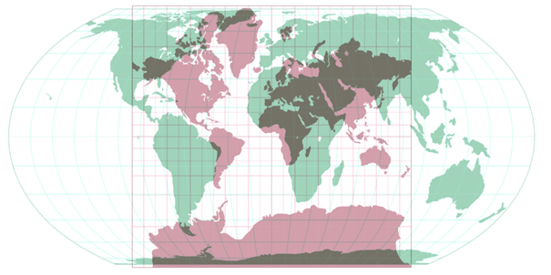
In the Mercator projection, Africa appears to be the same size as Greenland, when in reality it is 14 times bigger. This struggle over maps is not unique to Africa. In Asia, China insists on maps that include its expansive claims in the South China Sea, using cartography as a tool of territorial diplomacy. At the United Nations, the question of Palestine’s representation on maps remains politically charged, reflecting the broader contest over recognition and sovereignty. In each case, the symbolic weight of a line on a map far exceeds its apparent simplicity.
Maps also play a role in soft power. Nations use them to project identity and influence. Consider the “Pacific-centered” maps promoted by Australia and New Zealand, which shift the world’s orientation and place Oceania at the center. Or the Cold War era, when both the United States and the Soviet Union produced maps emphasizing their spheres of influence. In every case, the map is not merely a representation of space; it is a projection of ideology.
The classroom as a diplomatic arena
Perhaps the most enduring impact of maps lies in education. Children around the world learn geography through school atlases, wall maps and globes. The choice of projection, the placement of the center, the colors used to depict countries — all subtly influence how the next generation sees the world.
When students grow up seeing Europe at the center, Africa minimized and borders portrayed as eternal, they internalize a particular worldview. The classroom becomes an extension of diplomacy, where future citizens learn their place in a symbolic hierarchy. This is why debates about which projection to adopt in schools matter so deeply — they are debates about the future mental geography of the world.
A cartography of power
What may appear trivial — a line, a border, a projection — is in fact the product of centuries of power struggles. Cartography is not only about navigation or orientation. It is about shaping imagination, legitimizing authority and distributing voice.
To look at a map is to look at a story: a story of conquest, colonization, resistance and negotiation. To challenge a map is to challenge that story. As Africa seeks to reclaim its true size, as new projections seek to replace old ones and as contested borders remain flashpoints of diplomacy, maps continue to function as battlegrounds of representation.
Reading maps critically
In international politics, symbols matter. They guide perception, shape debate and influence decisions. Maps, perhaps more than any other symbol, carry this weight. They define what is central and what is peripheral, what is legitimate and what is excluded.
By questioning the ways we depict continents and borders, we open space for more balanced international relations. By teaching children that maps are not neutral, we encourage critical thinking about power and representation. And by recognizing the symbolic power of cartography, we see more clearly how the world is organized — not only physically, but politically and imaginatively.
So, the next time you stand before a map, ask yourself not only where things are, but why they are shown that way. For in its colors, lines and proportions, a map is never just geography — it is diplomacy drawn on paper.
[Kaitlyn Diana edited this piece.]
The views expressed in this article are the author’s own and do not necessarily reflect Fair Observer’s editorial policy.
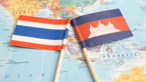
Thailand-Cambodia Ceasefire: A New Path to Peace or Prolonged Conflict?
Thai and Cambodian troops clashed in July over a century-old border dispute, displacing more than 270,000 people. Leaders in both...
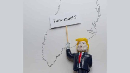
Trump Dreams of Minerals — in Ukraine and Greenland
In 2025, Trump shifted US focus toward fossil fuels while pursuing mineral deals in Ukraine and Greenland. He aims to...

Support Fair Observer
We rely on your support for our independence, diversity and quality.
For more than 10 years, Fair Observer has been free, fair and independent. No billionaire owns us, no advertisers control us. We are a reader-supported nonprofit. Unlike many other publications, we keep our content free for readers regardless of where they live or whether they can afford to pay. We have no paywalls and no ads.
In the post-truth era of fake news, echo chambers and filter bubbles, we publish a plurality of perspectives from around the world. Anyone can publish with us, but everyone goes through a rigorous editorial process. So, you get fact-checked, well-reasoned content instead of noise.
We publish 3,000+ voices from 90+ countries. We also conduct education and training programs
on subjects ranging from digital media and journalism to writing and critical thinking. This
doesn’t come cheap. Servers, editors, trainers and web developers cost
money.
Please consider supporting us on a regular basis as a recurring donor or a
sustaining member.
Will you support FO’s journalism?
We rely on your support for our independence, diversity and quality.

Comment